OVERVIEW
Cleanaway Waste Management Limited is an Australian waste management company. Founded in 1979 by Brambles, it has extensive operations in Australia and the United Kingdom.
I’ve been working with Cleanaway as a Senior UI/UX Developer from April 2017 and then I’ve been promoted to become Lead Front End Developer and responsible not only on the UX for Cleanaway websites but also all the other websites under Cleanaway.
BACKGROUND
In Cleanaway I lead on user interface and user experience for all of Cleanaway websites including all other websites under Cleanaway and also their mobile application. Responsible on a web journey for eCommerce site for Cleanaway and user experience for truck drivers mobile tablet app for waste collection in Australia.
I’ve experience in using tools such as Sketch, Adobe XD and Invision for wireframe and prototyping, had some knowledge on Optimizely for AB testing, and using Hotjar for web heatmaps, recordings, surveys and get feedback to understand customers experience when using our websites.
During my time with Cleanaway, i’ve been using tools like Invision, Sketch, Adobe XD, Adobe Photoshop and Bootstrap for UX work and WordPress, VueJs, SASS, GulpJs and Javascript for web development and front-end part.
UNDERSTANDING THE PROBLEM
When i first come and start working with Cleanaway, they always have a plan to improve their website experience that already serve their customers for more than 10 years. I always wanted to validate and understand these problems so me and my team take the initiative to run group discussions to decide what we can do to improve the performance of the websites.
We’ve come out with sets of questions and ask most of Cleanaway staff, customers and people who always comes to the websites to get all the informations.
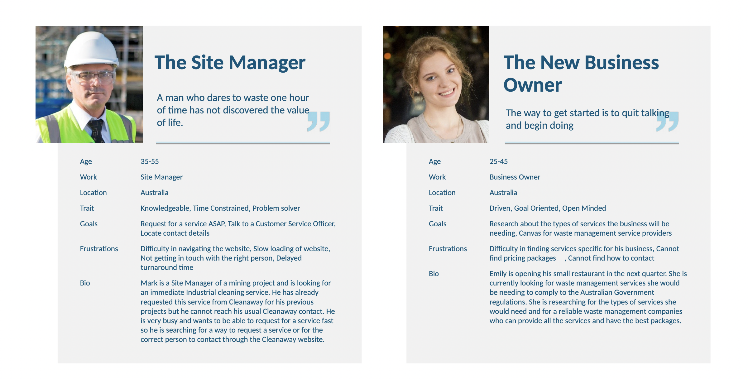
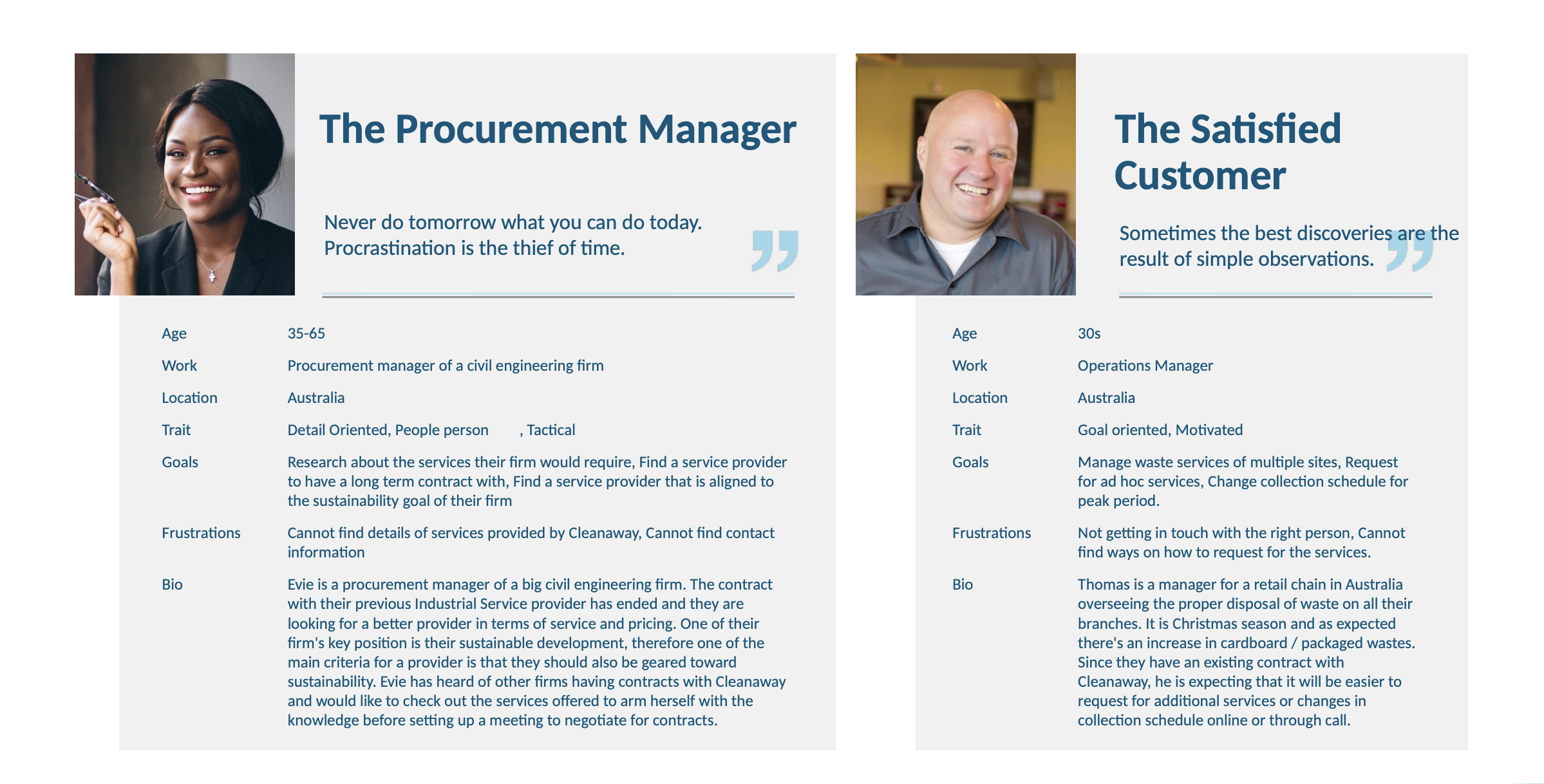
USER PERSONAS
Based on our research, we recognised that there were few user types that our product tried to solve problems for.
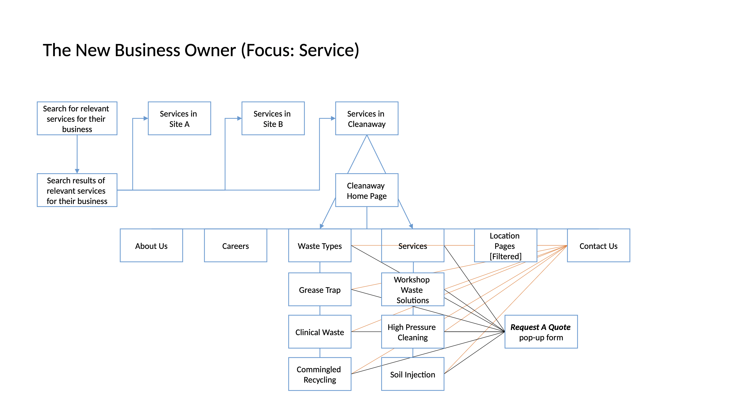
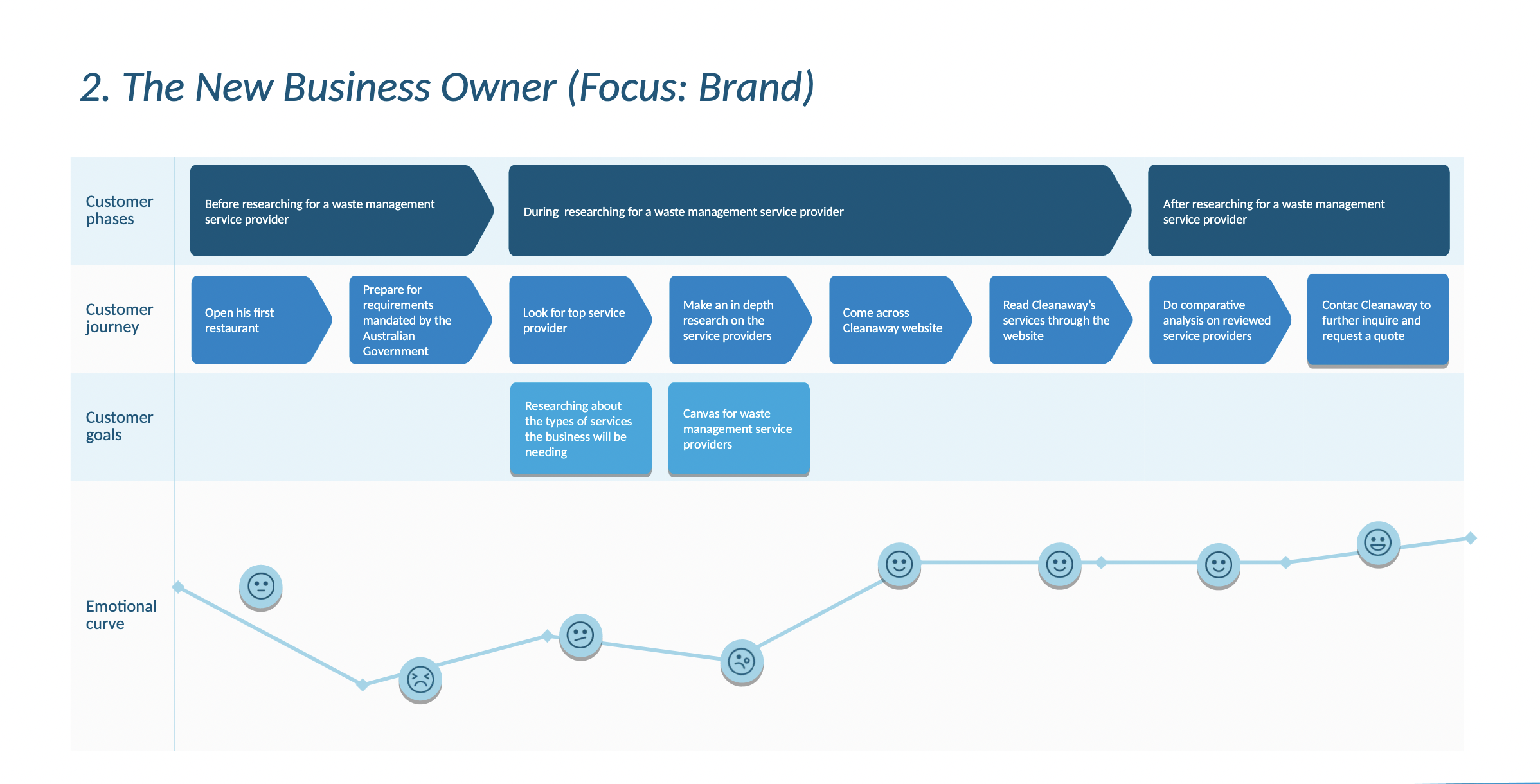
WEB JOURNEY
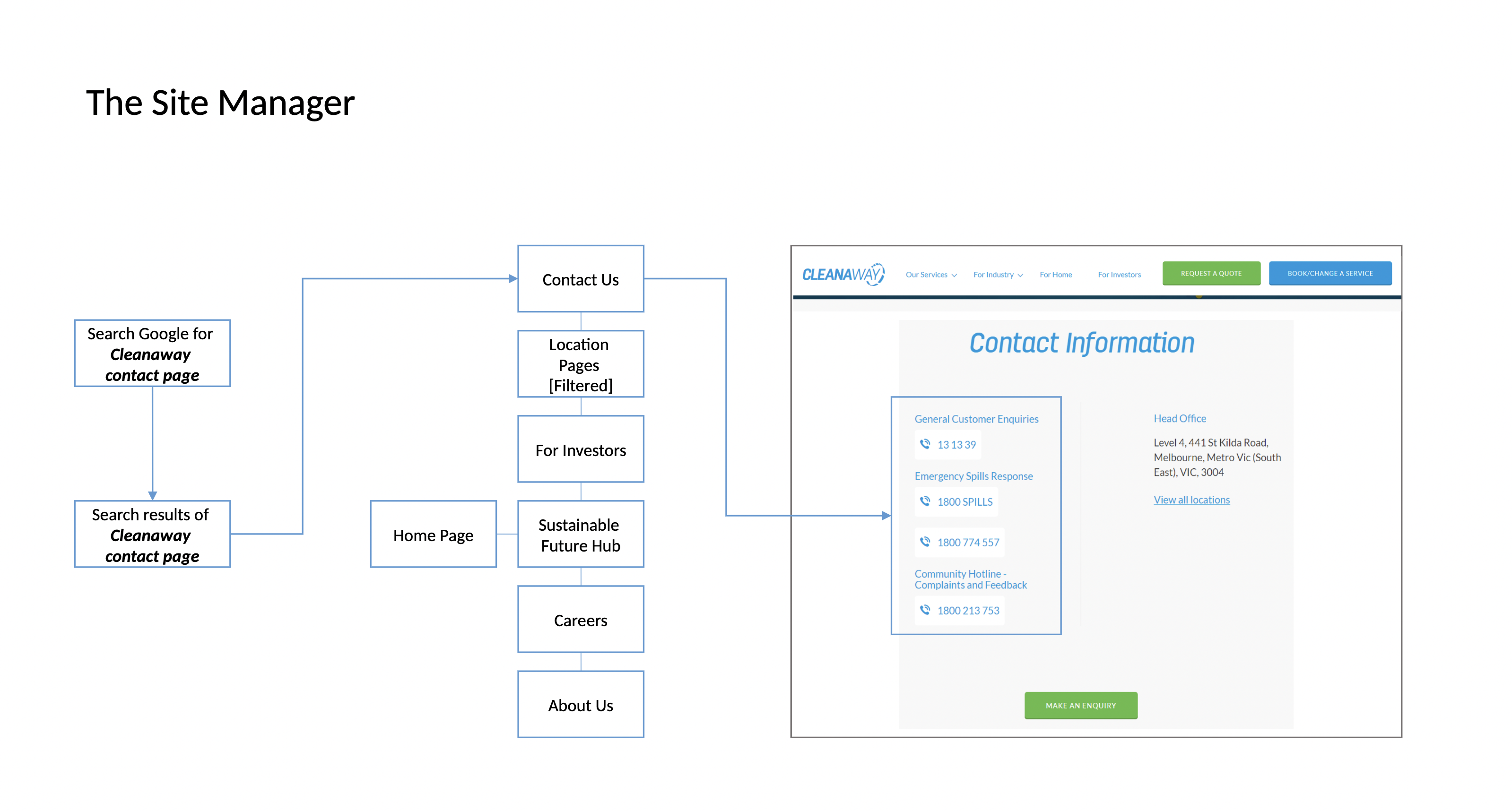
We’ve come out with few different web journey for few different user types. From there we’ve discussed what’s the best journey for the users.
DESIGNS
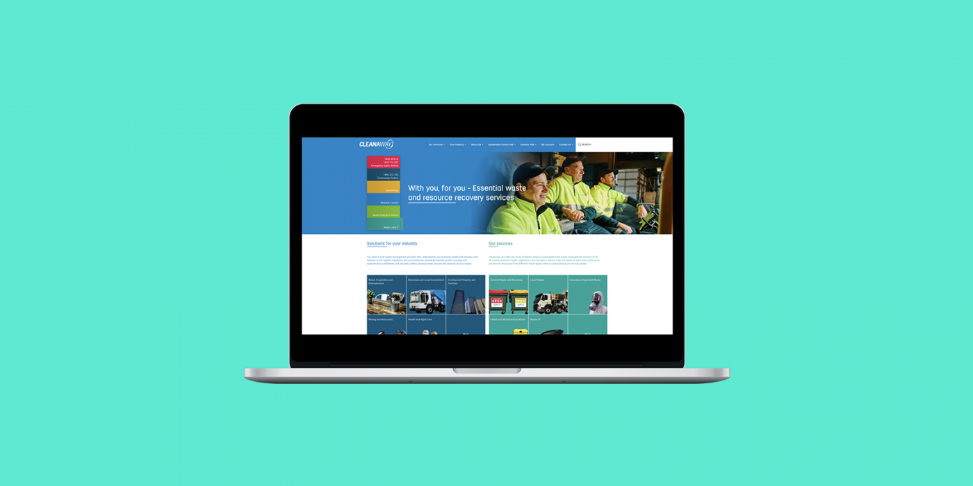
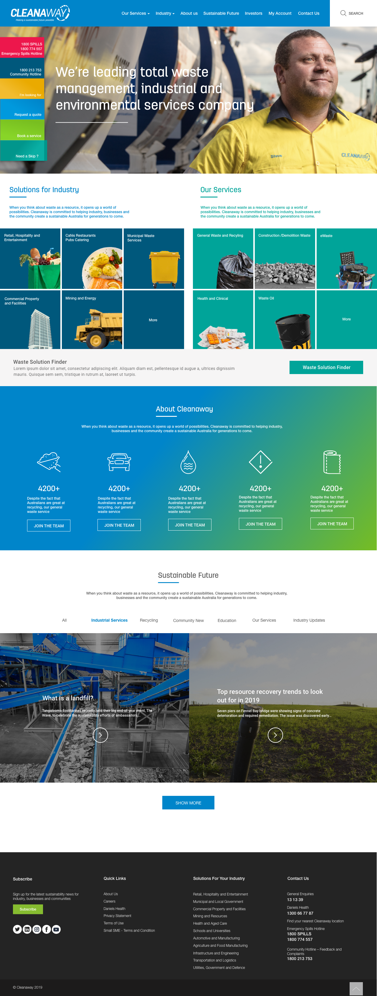
For the brand, I wanted to create a refreshing, minimalist and clean UI that conveyed trustworthiness and progression for future-oriented individuals.
Landing page
Our Services

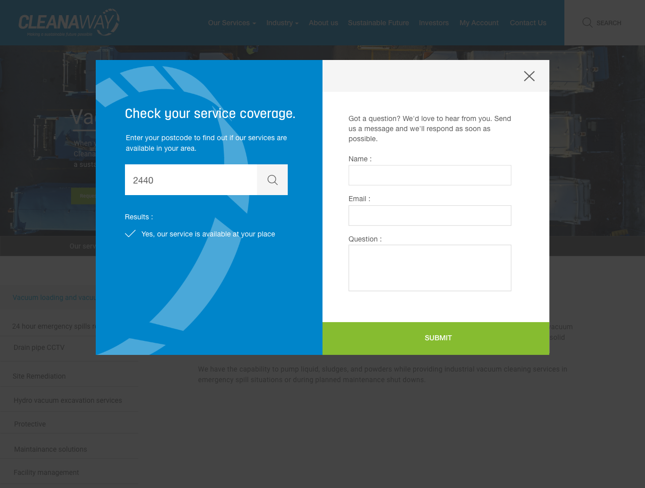
Service coverage
WORKING WITH TEAMS
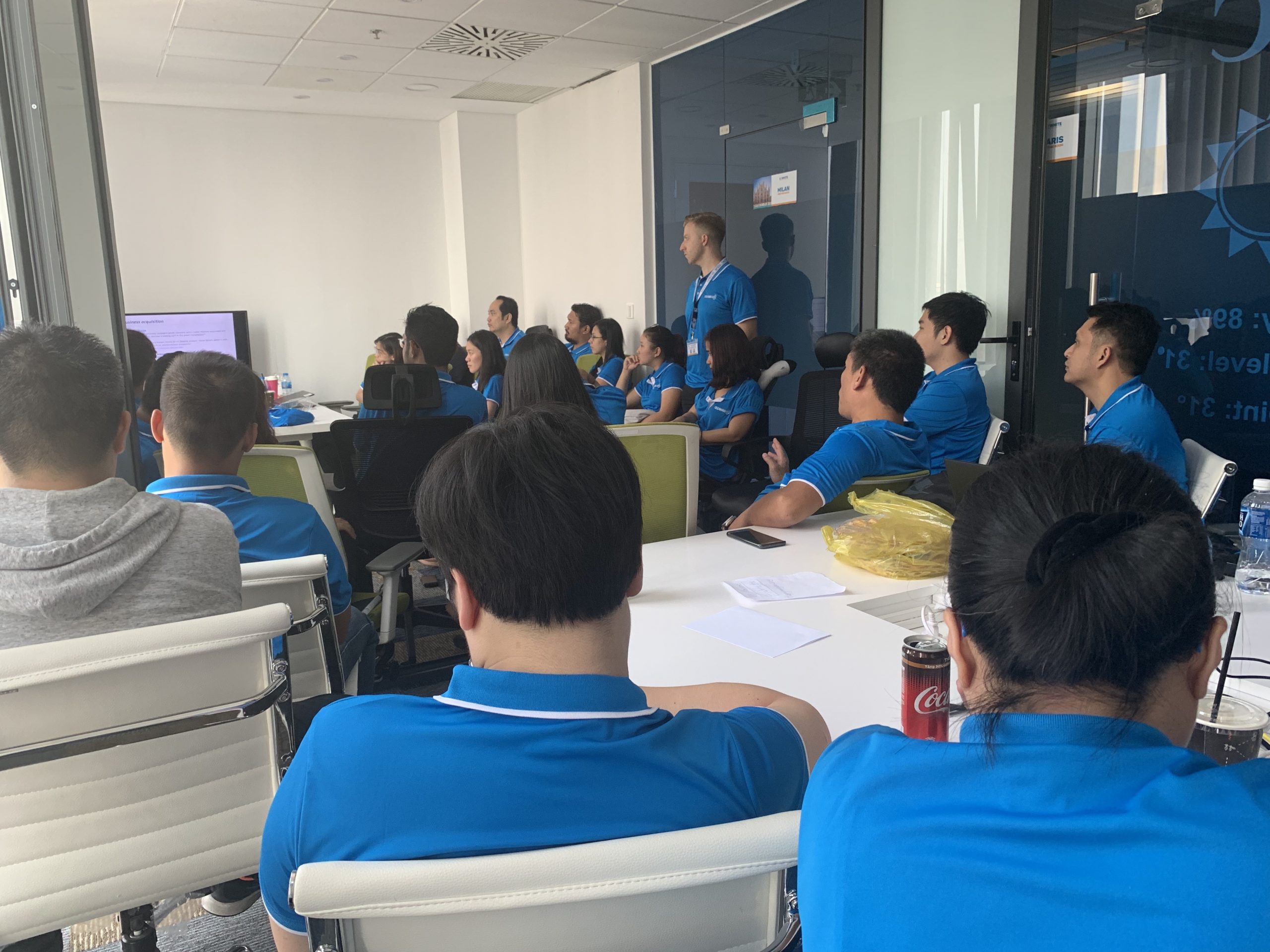
I worked closely with a team of Back End Developers, Front End Developers, Software Tester and Business Analyst. We have a guy from SEO as well.
